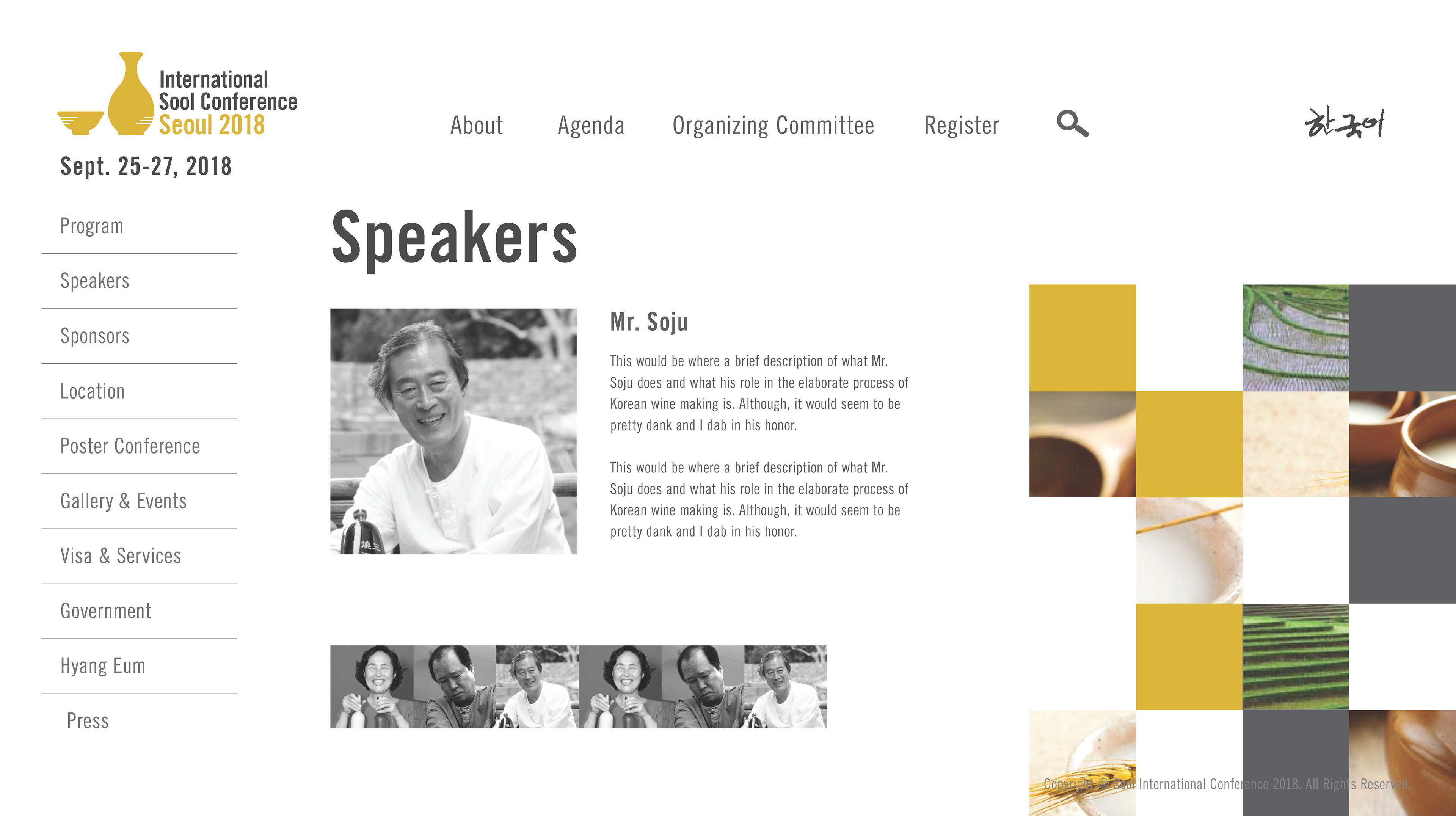
I had the pleasure to work with South Korea University and my classmates, to help work and design on a Suul Campaign. The class was split into teams and I was the team project manager for my group and had to keep the work on track and organized.
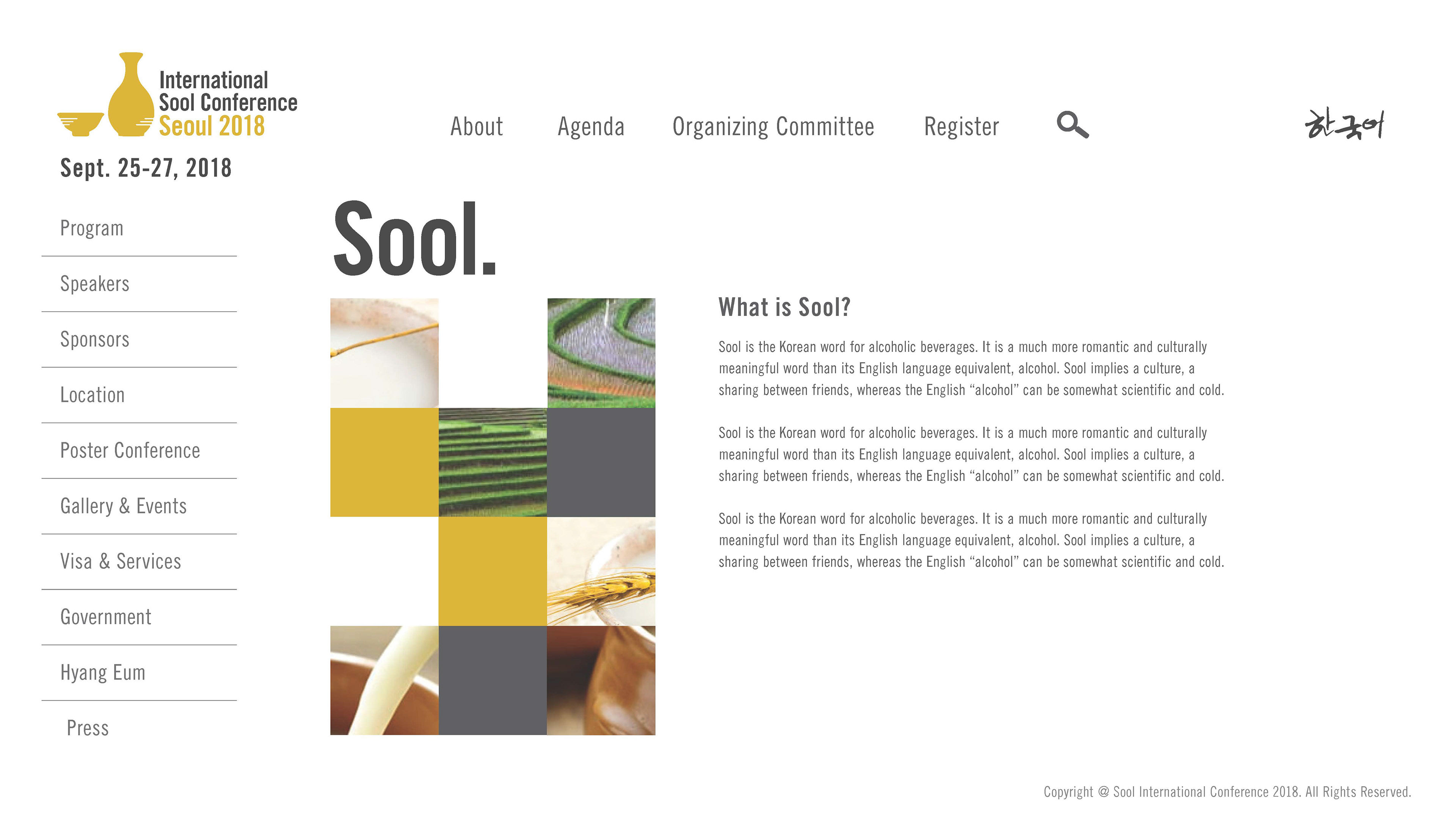
Suul is the Korean version of Japanese Sake, and it's a traditional rice wine/beer. We were assigned to design a mock website and work with a few Korean Suul breweries to design some of their Suul bottles.
The main agenda was to promote and celebrate South Korean Tradition, that was lost during the Korean war.
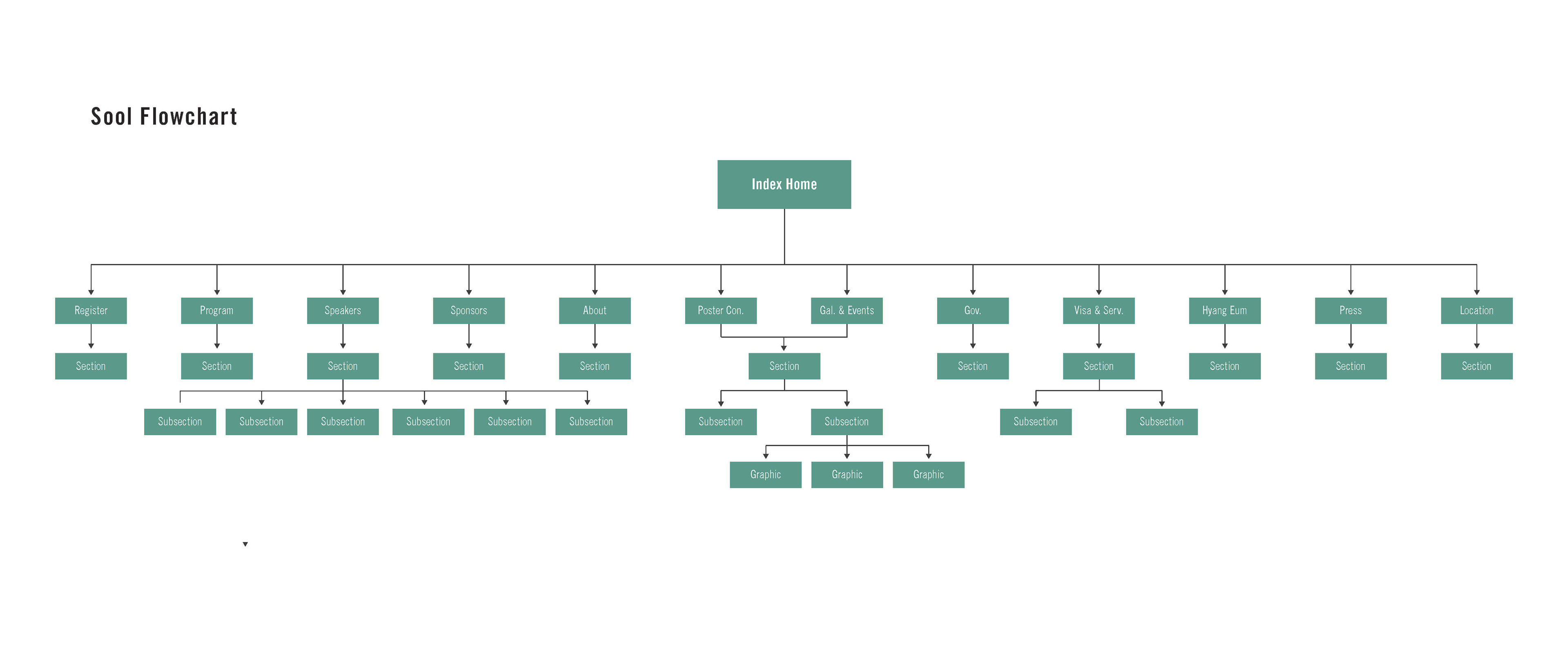
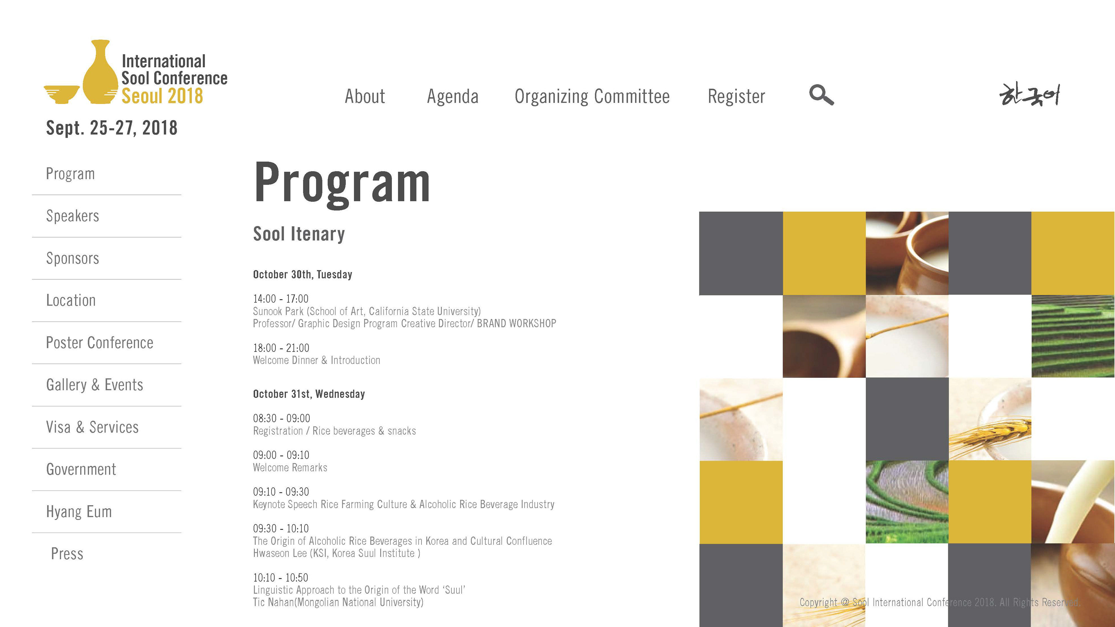
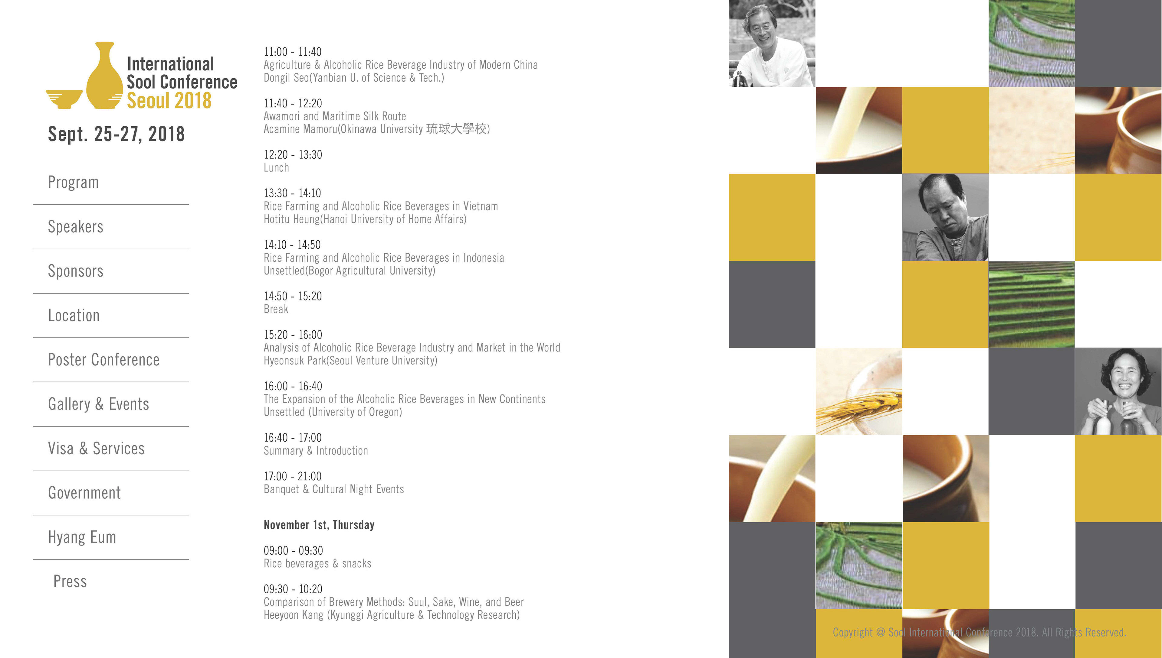
A flowchart was design on how the website would work.
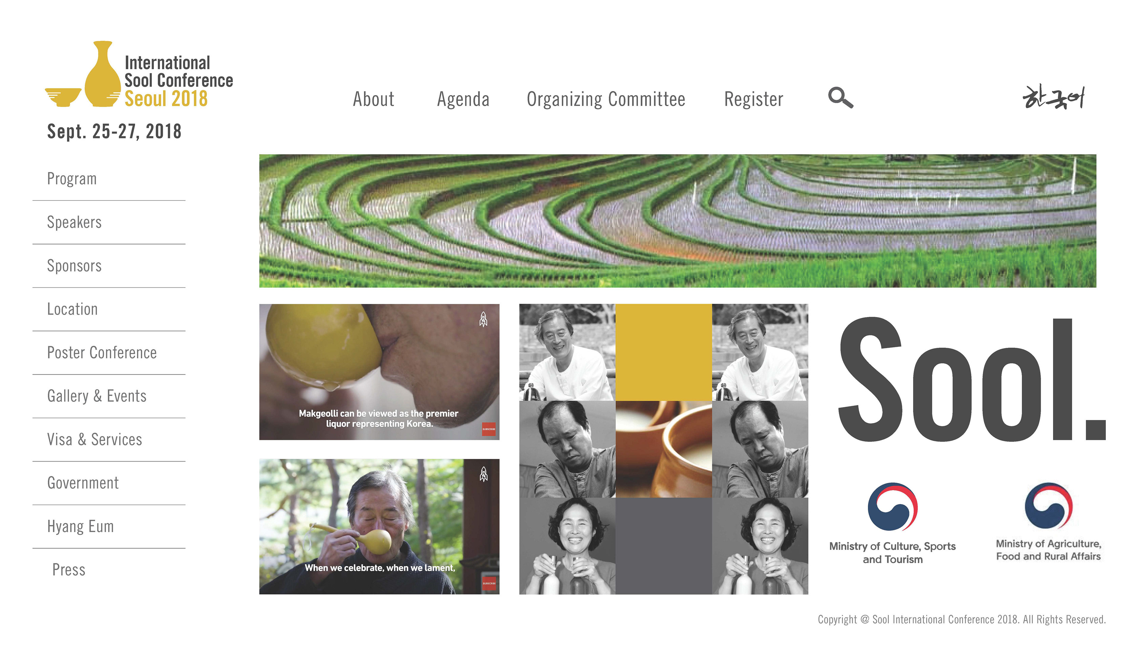
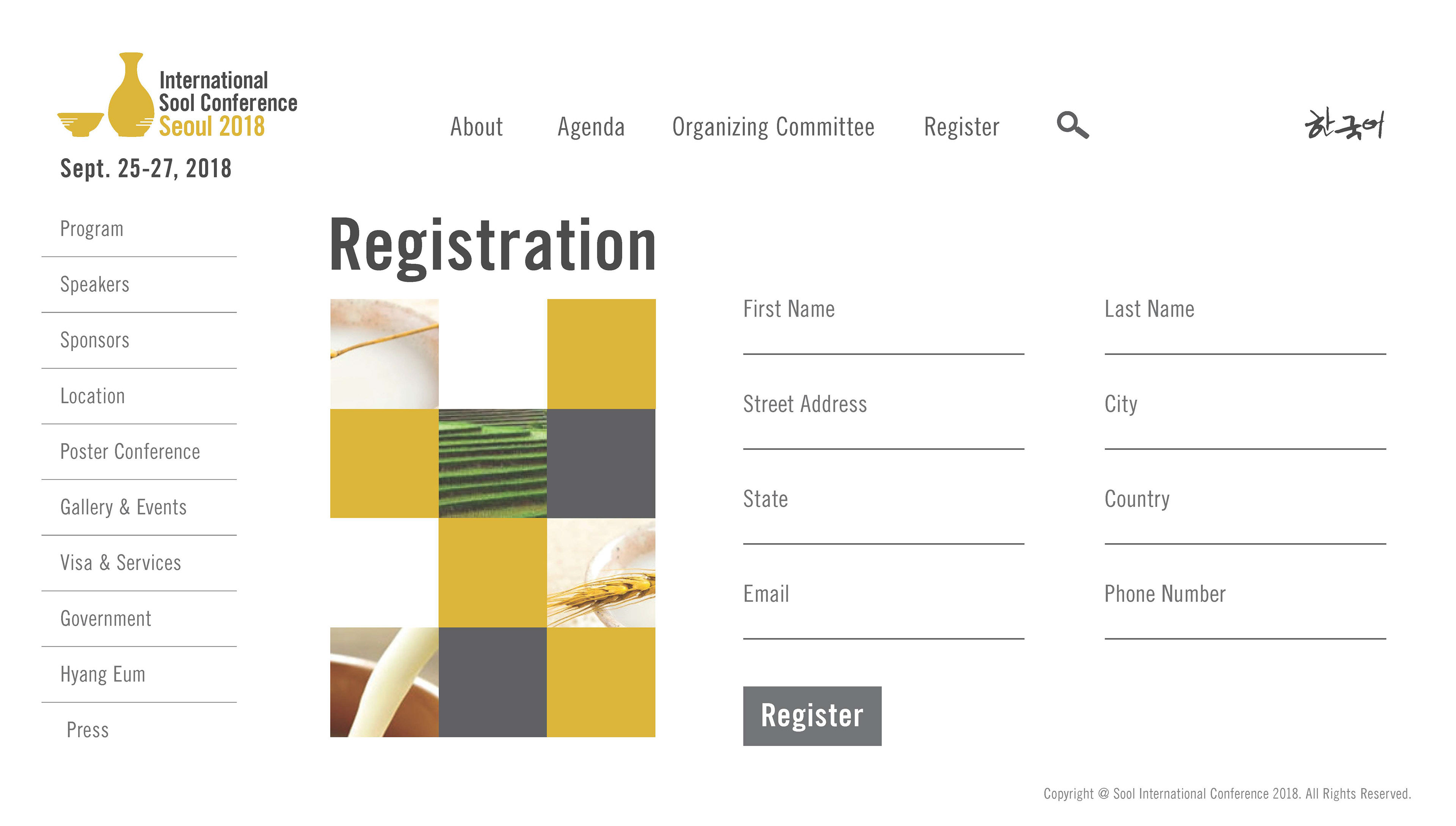
Worked with my group to design a layout concept of what the website would look like for the Suul Campaign.
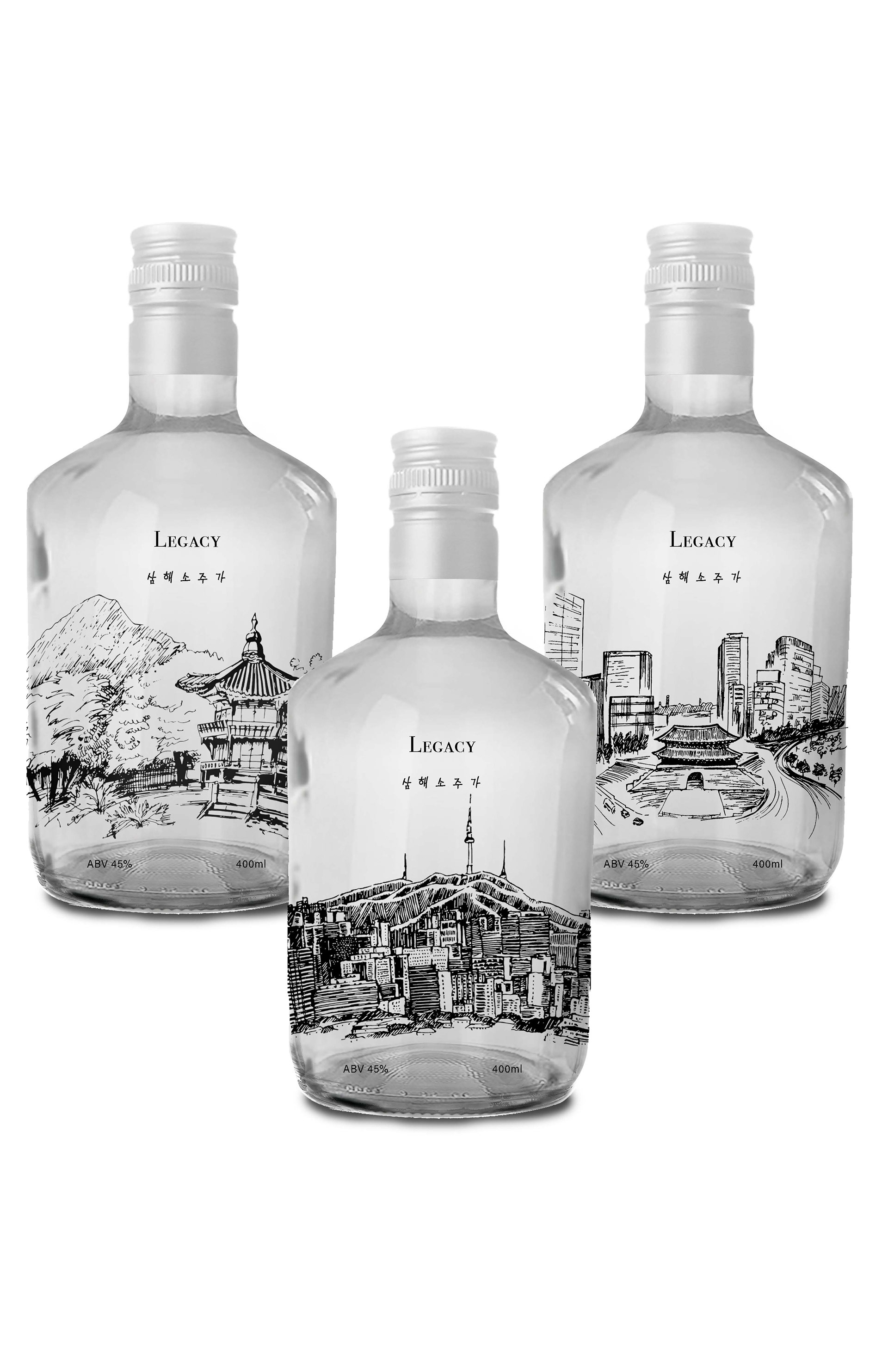
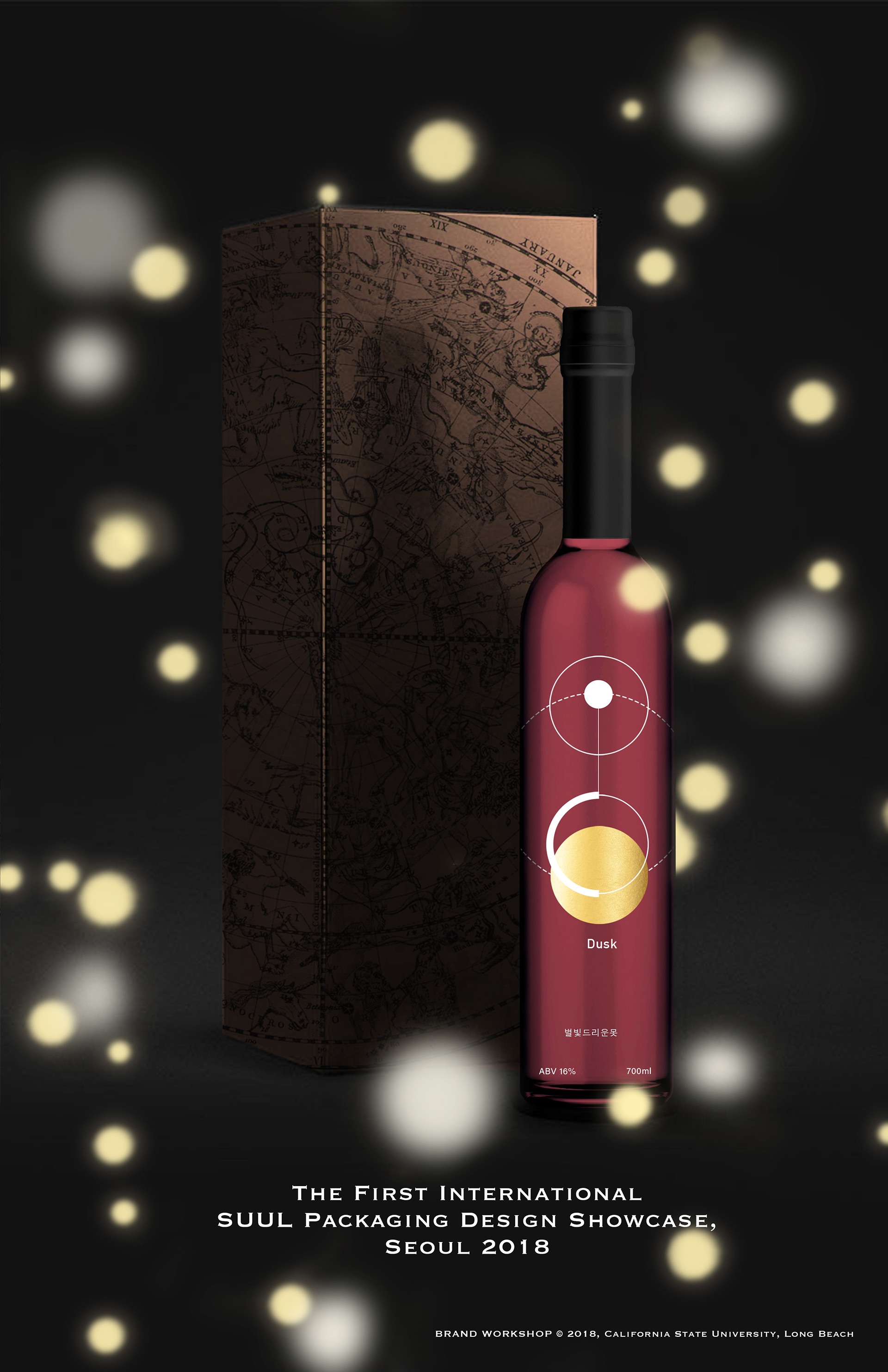
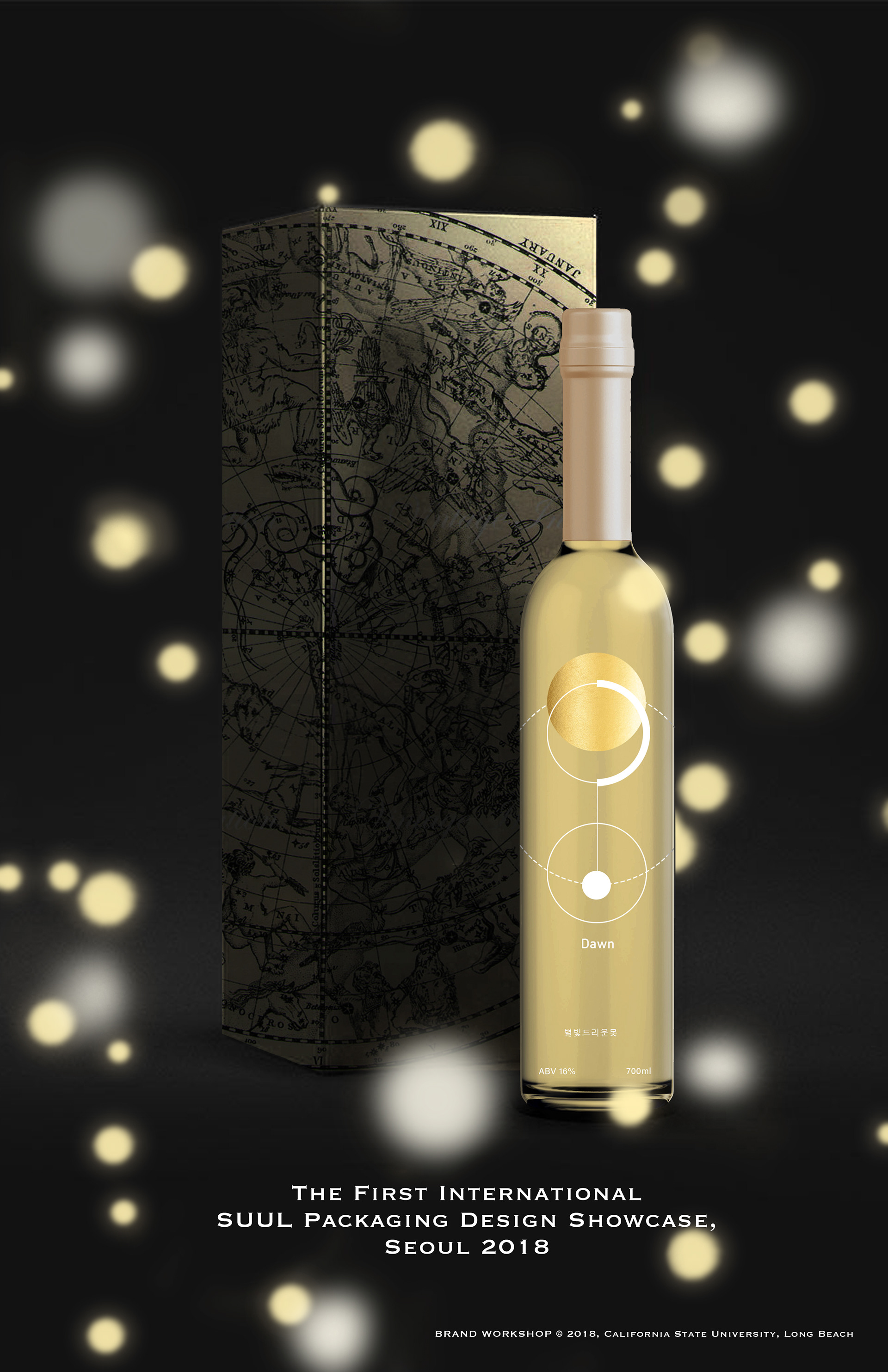
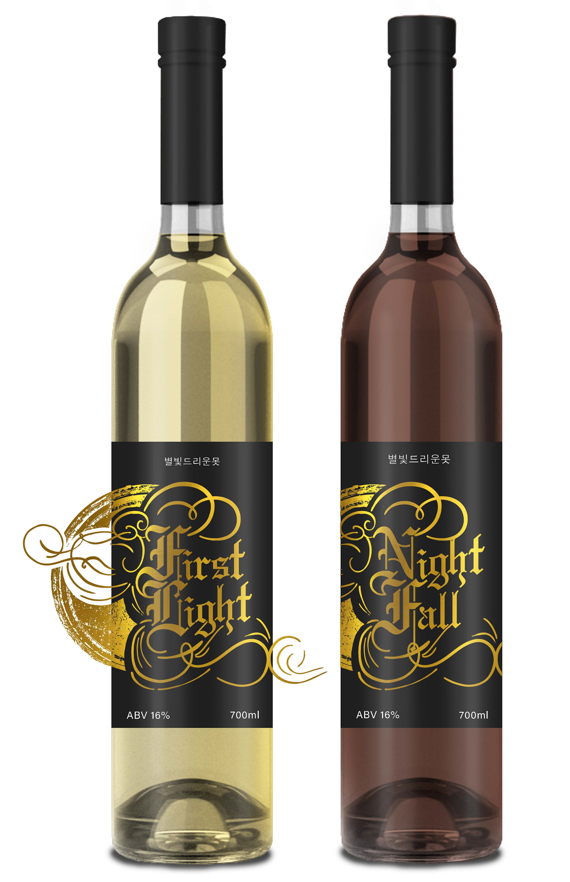
Here I have some of the Suul bottles that I designed for the first international soul packaging design showcase.
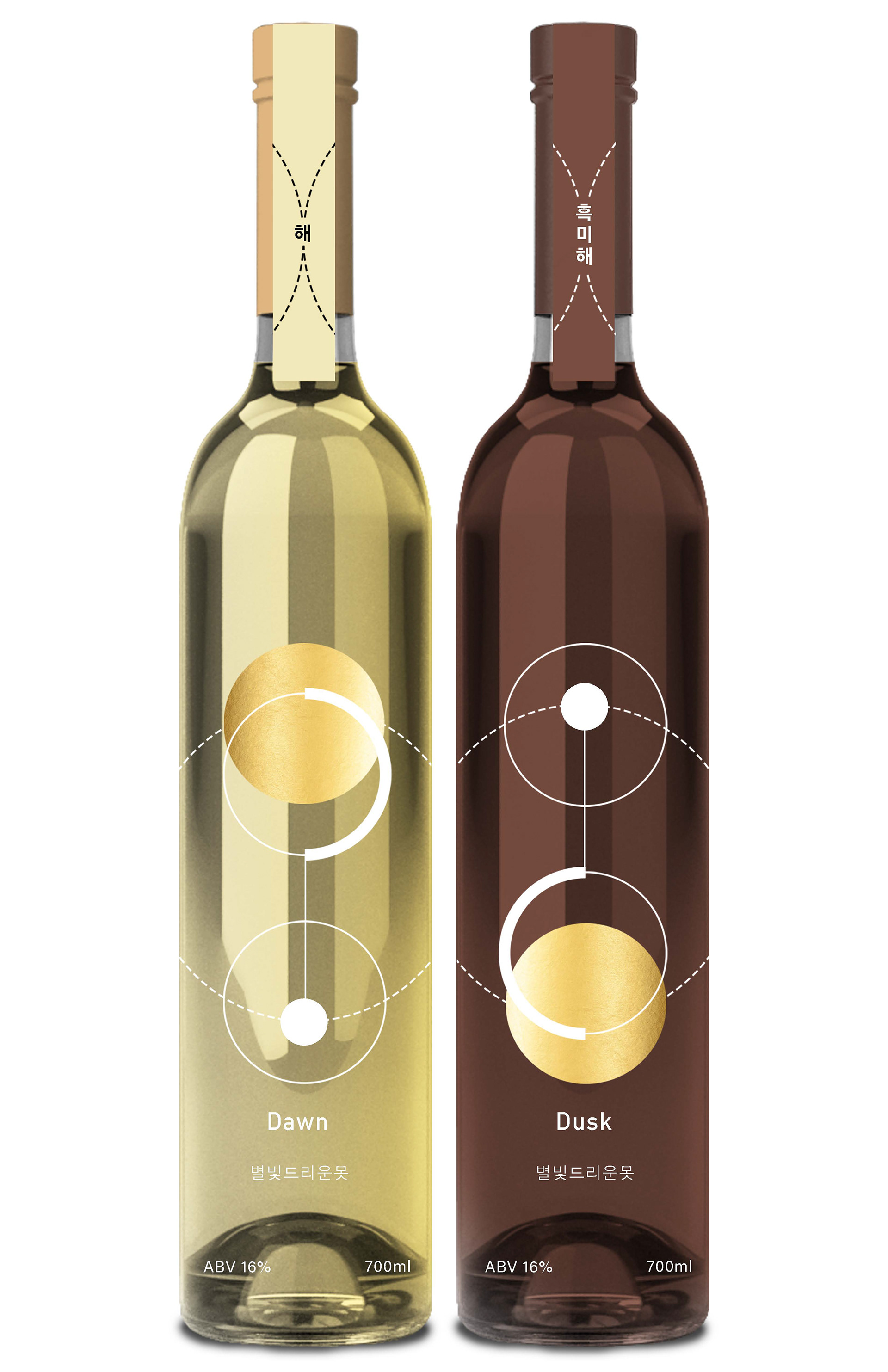
These red and yellow Suul were made of black and white rice. The design was based on the constellation given the name Dusk and Dawn, being similar in production but different in tastes. It was designed to be sold in a set or by themselves.
Two of my early design mockups for these suul bottles.
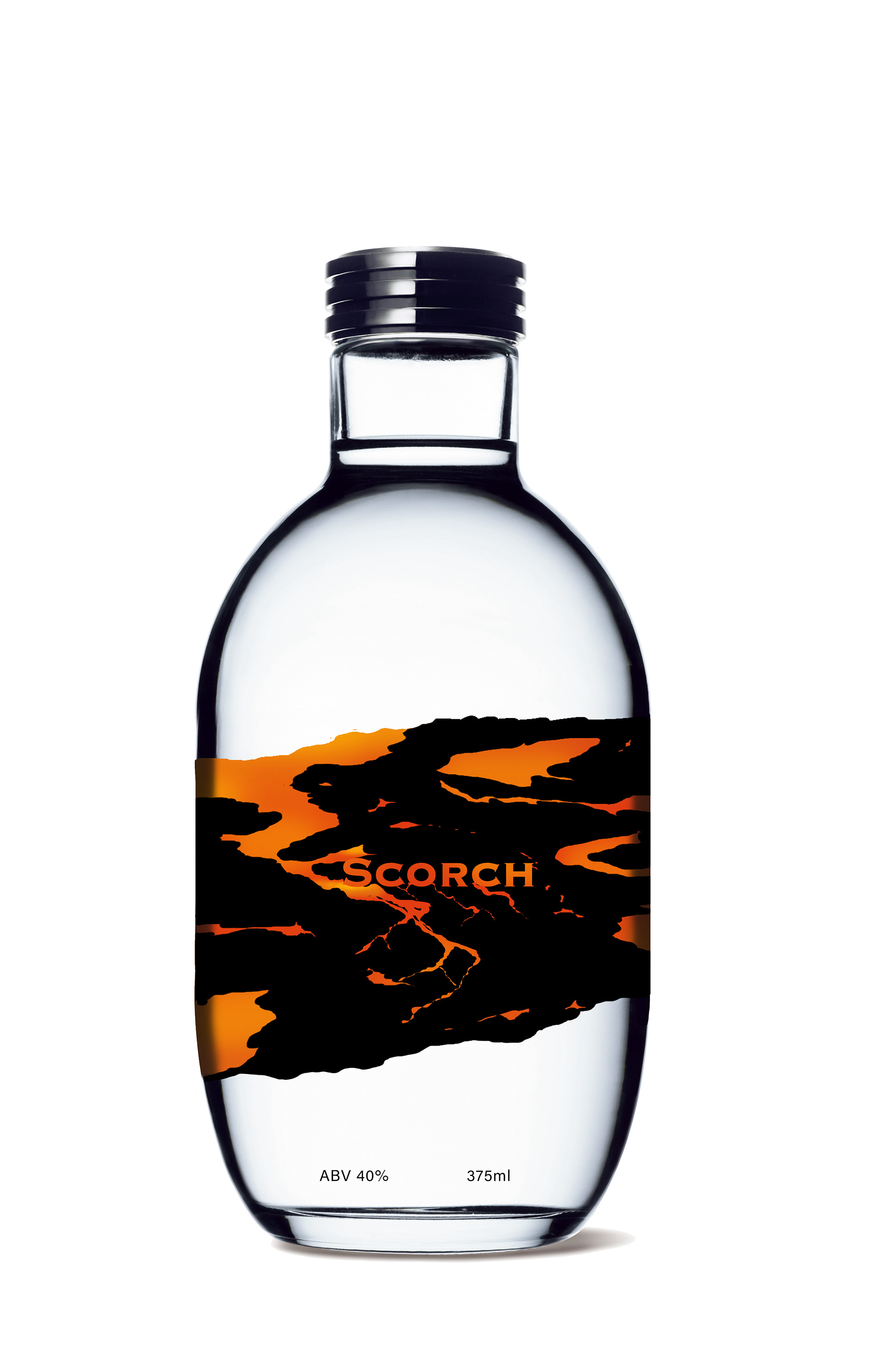
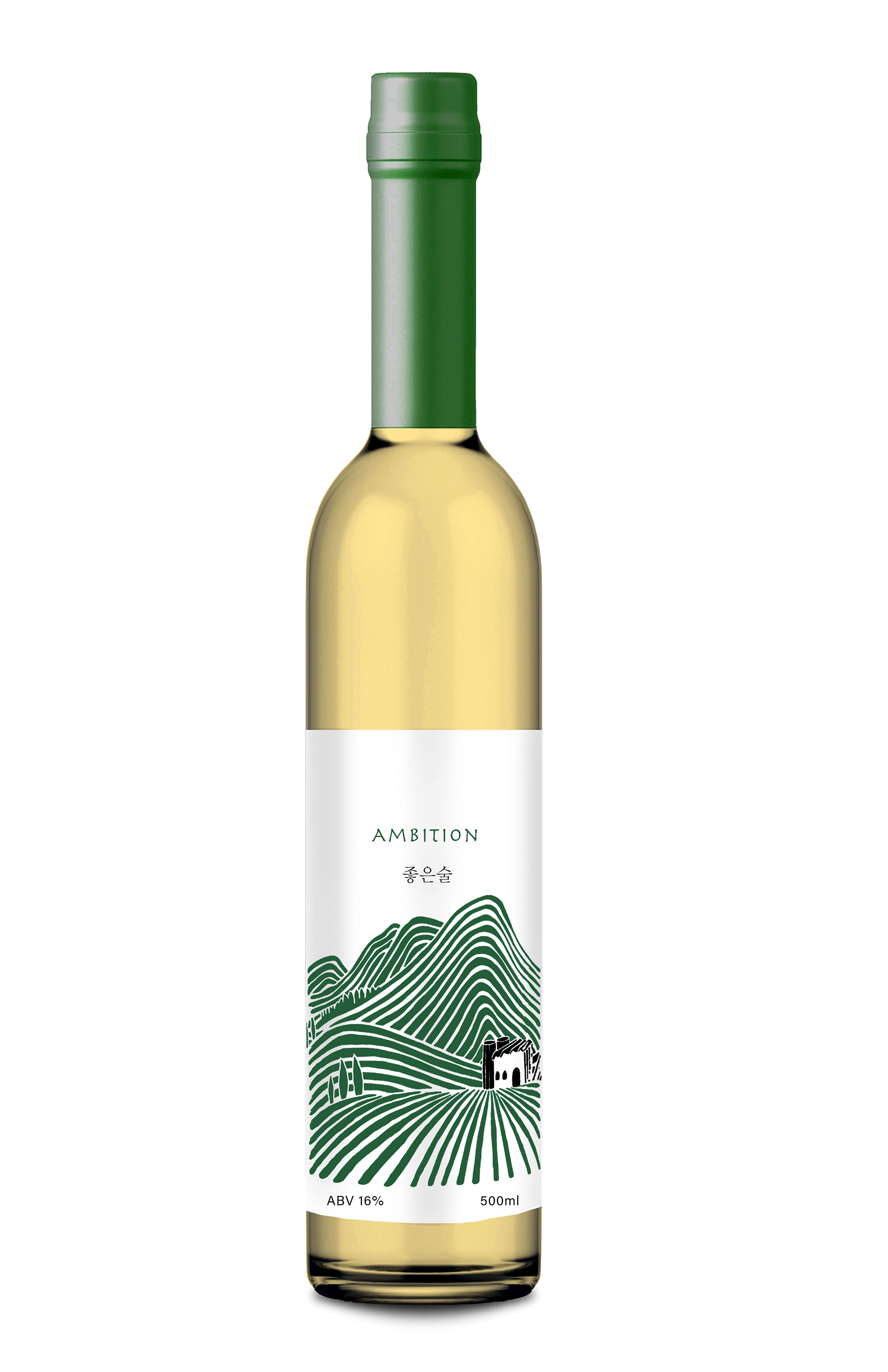
The bottle on the left was designed to match the tastes of this Suul it has a dry and burning tastes which were given the name Scorch. The bottle on the right was design based on the fact that this practice of Suul making is still done by hand and it is a long and tiring process, which is given the name ambition.
These last three bottles were meant to be a series for collectors to buy. The name Legacy was to show the rich and proud tradition of South Korea. The design was based on well known and popular locations in South Korea.